Weight.. could we talk about weight? No, no, no- not that kind of weight. And, could we talk about Balance? Okay, weight and balance aren’t just for those amazing Health and Wellness folks. Still. Weight brings Balance to your Visual Designs, especially in 2 dimensional designs such as we find in advertising, on our blogs, in other social media- in other words Photography Graphic Design is 2 dimensional and flat.
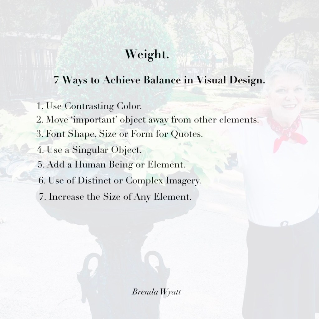
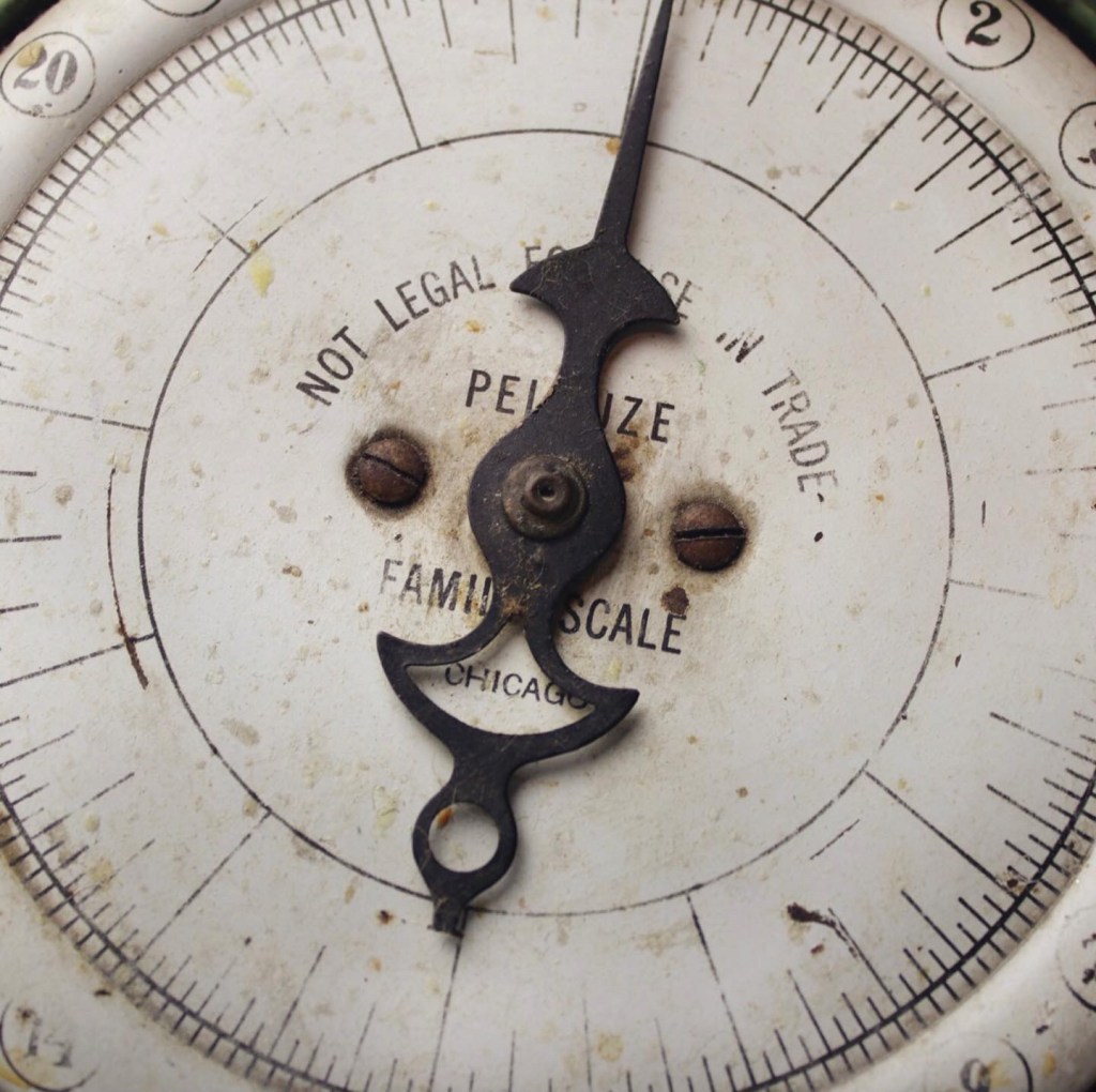
On a recent trip to New Orleans, I was having a Ball posing next to a rather weighty Urn.. it occurred to me that weight in graphic design brings Balance and Interest which you cannot achieve any other way. Then… as if to reinforce my thought process, I saw a vintage scale in the French Market. Scale is another one of those words in Design that relate to Balance. Though this scale was for weighing things! So… I jotted down 7 Ways to use Weight in Visual Design.
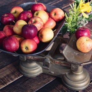
- Use contrasting color. (Apples anyone?)
- Move the ‘important object’ away from the other elements in your photos.
- Be careful with Font Shapes, Size and Form- especially for Quotes. *Folks are 3 times more likely to pause and read a well done quote- so it’s important to create them well.
- Use a singular object. Negative Space does add ‘weight’.
- Add a human being- yes, even if she’s faded standing next to a big iron urn!
- Use distinct or complex imagery. (Fill up the frame.)
- Increase the size of your image. (The first image is a good example)
Here’s the thing, Weight adds emphasis, importance and interest to your visual designs. Weight balance an otherwise same scale photography. Photo after Photo on an Instagram feed for example which are all the same- may look balanced yet not as interesting. Or you may use several photographs on a blog post, yet if you shift the ‘weight’ as listed above in your photographs, they tend to be more eye catching. The same goes for Store Displays. Adding things of different weights or sizes to your displays make them more interesting.
Weight also signals that there might be something interesting or important in the message you’re sending to your reader. *A warning here… Weight can be overdone and perceived as ‘shouting’. Even type fonts can be a little too bold or scary!
Have a wonderful week, folks. You’ve just gotten a message to ‘Add Weight.’ Couldn’t resist that one!
Love y’all, Brenda
The July Planning Guide is almost ready! July is a pivotal month in the Retail Calendar. This one will be different than the others to reflect the upcoming Fall/Winter Season. If you’d like to receive it- send me an email at brenda@brenda-wyatt.com

Beautiful writing
LikeLiked by 1 person
Thank you 🙏💙
LikeLike