A fun way to Write is to assign Human Characteristics to Inanimate Objects such as Doors.. It’s no secret that I love architectural elements. I take photographs of fences, railings, windows, shutters, windowboxes and more…especially Doors. Though this Writing Lesson may focus on doors, the technique applies to any inanimate object of your choice.
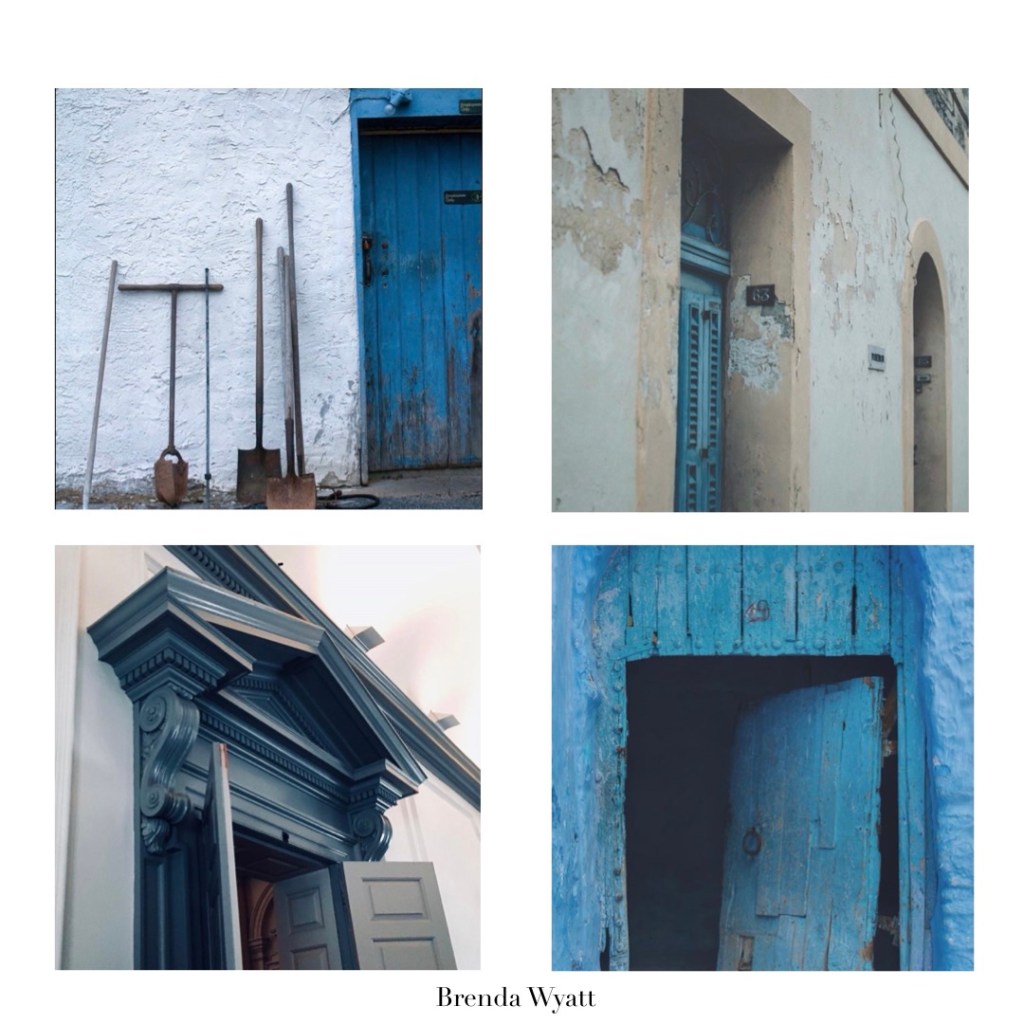
Take this first block of doors… that White Tool Shed, she’s a hard worker, down to earth with an unexpected flair for the dramatic with that blue door. The Hidden Door on a side street strikes me as a shy, private one- though hoping to be found, she secretly longs to stand out. That impressive Pediment in Constitution Hall, speaks of confident authority- yet one who probably wears sensible shoes. In contrast, there’s the humble thrifty landowner who probably caught paint on sale and didn’t give a whit about that showy color! Don’t you know that’s true!
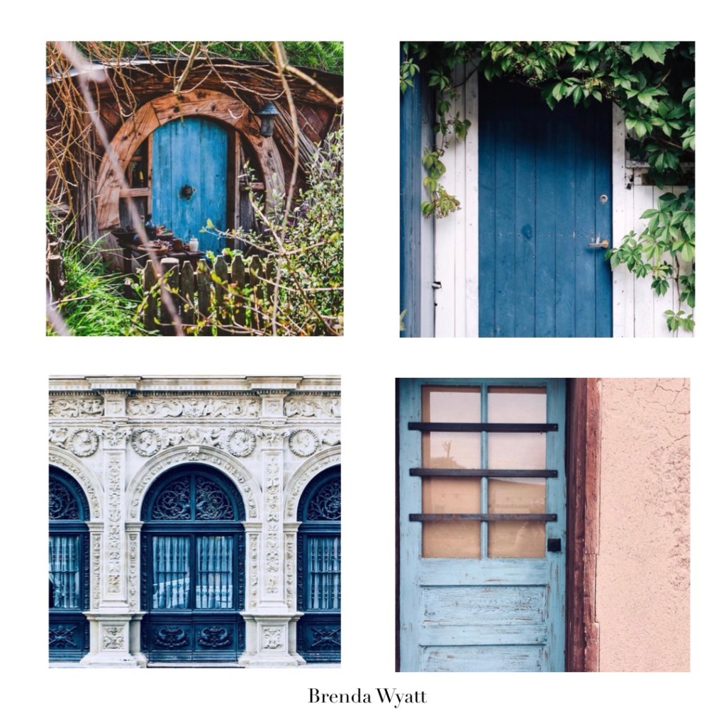
In this block, there’s the introverted nature lover who obviously enjoys quiet and solitude. Bermed in, yet that blue Door is ready to welcome a friend or two. Now, the pretty Door with a Vine is a cheerful soul, a generous gardener who offers rustic dinner parties after holding a cooking class. Don’t you love her already? Oh my, that amazing Ornate Exterior has amassed a fortune, is also home to a fashionista. She’s a not-so-subtle standout with impeccable taste. The humble rustic door is concerned with protecting house and home- how do I know this? Well, it belonged to pioneer Kit Carson!
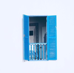
I had to include at least one window, a warm, open, happy personality, who allows us to see just the right amount of her humble home. as she breezes easily through her life.
Of course, the opening image is a Sanctuary Door- welcome, wise and strong. It’s as if She knows, at some point in our lives, we’re all going to need a discreet Listener. You know? I love them all- beautiful, unique as a fingerprint- serving their own purpose- big or small. Still. If I had to choose, it would be that white tool shed with the blue door. Why? I’ve decided that she’s actually a ‘Work in Progress’. Yes, I definitely relate to that! Which one would you choose? And, if you’d like to give it a try, assign human characteristics to an inanimate object like a Door.
Love y’all, Brenda
P.S. If you’d like to be on our mailing list for the free planning guides- drop me an email at brenda@brenda-wyatt.com


 Collections… we all have a collections of some sort. Whether it’s Stamps, Spices (yes, when we travel I bring back spices) Vintage Luggage? I had a small collection once that served as a portable office. Some collect oddities such as watch parts. And, I’ll admit to having a collection of garden pots. Old Garden Tools- yes, the quirkier the better. Silver Serving Pieces? Books? Heirloom Seeds… oh yes, that’s a very nice collection to have.

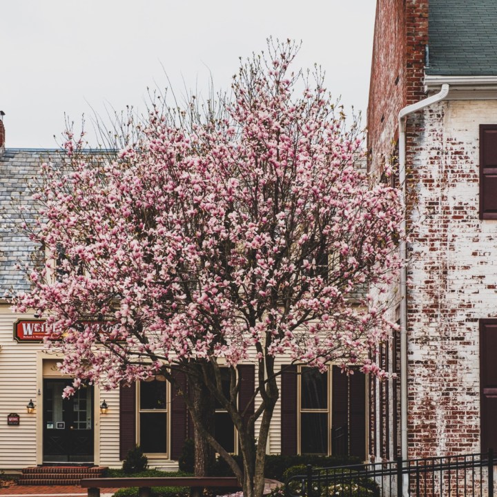 Curb Appeal. Spring seems the perfect time to think about it. Realtors agree that Curb Appeal is the great Attitude Adjuster. 3 Seconds is all it takes to form an opinion or create an impression. It’s interesting that the same 3 Second Rule applies to Social Media, Blogs or Websites. Visual Impressions are everything. Those Pink Blossoms and the Black Door would draw me in. I worked for a beautiful Garden Shop, Most of workdays I was responsible for getting the shop open- with the most important job being- a well swept, clean entrance with a focus on the door. Clean Windows, our most beautiful plants, trimmed and watered and the sign put outside.
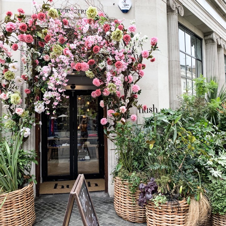 Did you know that a clear Landing Page, like an Open Gate invites visitors to look around your site? There needs to be a balance between the Shelter and Open Spaces. The places where visitors gather and the secure shelter where the living or business is done. A clean welcome entrance, made attractive with green living things adds to the experience whether it’s upscale or an humble place.
 I’m not looking for perfect, just extra good.. Give me one fabulous, well maintained feature, like that Window Box. Give me a measure of simplicity. Even if the site has more formal structures- well kept, clean swept means even more.