 I was feeling contemplative about the Fourth of July- okay, I was peeling potatoes for the potato salad- a mindless task… that’s when contemplating is easy. We had just gotten back from a last minute trip to Washington D. C., a city that is filled with more profound history and symbolism than perhaps any other in this nation. It’s a white columned marbled and statuesque city- some of the marble was quarried right here in Alabama! Of course I’ve been to DC several times in my long and storied life- yet I always come away with a sense of awe and wonder; always learning something new…or something I knew seems to come alive in my mind. For instance, the expanse of the sky overhead is startling for a major city- there are no skyscrapers- by law. Why?
 Look at the statue that crowns the dome on top of the US Capitol Building. Her name is Freedom.
- No building shall rise above Freedom.
- Nothing in our nation’s capital is allowed to cast a shadow on Freedom.
Pause and contemplate that! Profound, especially when you consider that Freedom was commissioned in bronze when our nation was divided- literally by civil war and unrest. The pediment that Freedom stands on is embossed with the Latin words E Pluribus Unum, out of many one. The center part of the capitol building had been destroyed during the War of 1812.. it was being rebuilt; the new plans included the iconic dome…made of cast iron weighing 1000’s of pounds… President Lincoln insisted that work continue on the building despite the war that had torn us apart, so the American people would be encouraged that our nation would once again be united and whole.
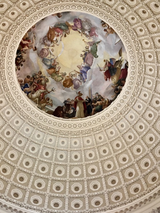 When we last visited Washington D.C. renovations were being made to the interior of the dome, now completed, it is once again a masterpiece. I couldn’t help being reminded of one of my favorite Scriptures…
‘Since we are surrounded by so great a cloud of witnesses who have gone before us, let us throw aside every encumbrance and run with patient endurance the portion of the race set before us…’ Hebrews 12:1
George Washington figures strongly in the painting- he is flanked by Liberty and Victory within the dome and each symbolic creature seems to be looking down from the heavens…other figures represent aspects of American life and industry that helped forge our freedom. For instance, Mercury is offering a bag of gold to Robert Morris- the financier of the American Revolution, the war which defeated tyranny and the power of a monarch. Americans prize freedom; historically, we’ve been willing to fight and struggle to remain free. Now, I know most of you are thinking…
‘Wow, that’s pretty heavy stuff to be thinking when you’re peeling potatoes.’ Well, yes, I guess it is- however, even Southern girls can contemplate things like this quicker’n whipping up a bowl of potato salad! After all, it was the Fourth of July- it’s not all about fireworks and barbeque- though I must admit to lovin’ the tastier aspects…. George Washington loved pit barbeque- even gave a few barbeques himself! A tall athletic man, Washington was also endowed with amazing leadership skills, wealth and an impeccable reputation- wouldn’t even lie about cutting down a cherry tree as any school age child is taught. The cherry trees surrounding the Tidal Basin evoke his memory. George Washington was honored as a Revolutionary War General, the First US President and also called The Father of our Country. Washington was named a national icon in the 1800’s when the new capitol dome was being designed. The dome’s design includes a feature that bathes the entire Rotunda in light. Light is symbolic of Truth and Goodness… the two virtues that our government and her people should always strive to attain.
Anytime you’re going on vacation to an historic city- there’s so much to see and do…it’s good to have a few goals. For this trip to Washington DC, the purpose of our trip was to attend an award ceremony at the Pentagon and take the tour, which included the location in the building where an airliner struck the Pentagon on 9/11- the damaged section is now a chapel with an honor anteroom, including a window looking toward the frightful path of the weaponized plane and overlooking a memorial garden for the 183 lives lost that fateful day. Also we wanted to see the newly renovated dome, eat a lobster roll at Luke’s near the National Portrait Gallery, eat at Bobby Flay’s Burger Palace in Georgetown and we had plans to watch the somberly beautiful- Changing of the Guard at the Tomb of the Unknown Soldier in Arlington National Cemetery. 
The day we were there, four funerals were to be held. As we waited for our tram to take us back- everyone became quiet and with hands over heart- we watched as a caisson slowly passed by- with 6 saddled black horses- the horses on the left had riders…the horses on the right were riderless adding to the beautiful yet haunting sight. No photographs were taken out of respect for the slain veteran. The architecture in the cemetery is astounding in its masterful detail.
I had finished making our Fourth of July potato salad… A thought had occurred to me- Just how long had it been since I had actually read the
Declaration of Independence and why among all of our national holidays had I not made a tradition of reading it? We read the Thanksgiving stories of Pilgrims and Indians, we read the ‘Night before Christmas’ to our bright eyed children…of all the traditions we have in this great nation…why not read the Declaration of Independence on the Fourth of July? Oh, I think we all know some of the beautiful phrases-
- ‘When in the course of human events, it becomes necessary…’
- “We hold these truths to be self evident, that all men are created equal, that they are endowed by their Creator with certain inalienable Rights, that among these are Life, Liberty and the pursuit of Happiness.’
- ‘And…with a firm reliance on divine Providence, we mutually pledge to each other our Lives, our Fortunes and our sacred Honor.’
Yet somehow the whole declaration and its history isn’t dwelt upon annually. For instance, when you read the whole document- just the reading of the indictments of the monarch, King George III- are extremely informative. The time frame of it’s writing is also interesting… the Revolutionary War was already underway when the declaration was written and ratified. Even more pressing and dramatic to contemplate- British war ships were bearing down upon New York Harbor!
In June of 1776, the colonies had become increasingly united concerning the need to declare independence from the Crown and Parliament. The delegates appointed a Committee of Five, which included Benjamin Franklin, John Adams and Thomas Jefferson- Time was of the essence…
Jefferson was assigned the task of writing the declaration…he had a little over 2 weeks to write what would become one of the most important documents in human history. After consulting others who edited the document… Jefferson wrote that they ‘mangled it’ even as he exclaimed in his later years that the edits to sentence structure and removal of a full fourth of his original produced ‘the majestic document’ we now know as the Declaration of Independence…it was accepted on July 2, 1776. With that, the colonies had officially severed ties with Great Britain. John Adams believed that eventually Independence Day would become a day of celebration for generations.
- On July 4 with a few more changes…
- the wording was approved, it was signed and sent to the printer.
- Two hundred copies were printed-
Now, this is important! President of the Continental Congress, John Hancock sent a broadside copy of the Declaration to General George Washington, who ordered that the declaration be read in full publically on July 9, 1776 to encourage folks to join the cause and to inspire his troops in New York City…wait for it…
- The Declaration of Independence was read aloud… as 1000’s of soldiers on British warships were in New York Harbor!
- This is profound enough, yet when you consider that 225 years later… the United States was attacked near the same location.
- Standing overlooking the New York Harbor the Twin Towers were pummeled by those who would terrorize the American People.
- Symbolism is one of our greatest teachers… Overlooking the same New York Harbor, rising up out of the ashes, in 2014 the new and gleaming One World Trade Center stands 1776 feet tall…
 May I be so bold as to suggest that-between July 4 and July 9 of each year… we make an effort to read the Declaration of Independence?After all, it ultimately became the spectacles through which the US Constitution is interpreted. And in the reading of it, perhaps we will hear the echoes General George Washington’s voice , full of truth and goodness- as he declares Freedom from Tyranny and hear the inspiring words of the majestic document that still inspires generations..
The Declaration of Independence- ‘…with a firm reliance on the protection of divine Providence, we mutually pledge to each other- our Lives, our Fortunes and our sacred Honor.’
Every thing they had was offered for the cause of Liberty- their lands, possessions and incomes, their very lives and the one thing these brave men valued above all- their honorable reputations.
 Remember Freedom? Standing high above our nation’s capitol building? Contemplate Freedom, often. Let nothing overshadow Freedom. Let nothing rise above Freedom.
Independence Day is a wonderful national holiday, full of many reasons to be thankful for the protection of divine Providence – I hope yours was full of good food, fireworks, inspiration and contemplatin’ Freedom.
Love y’all, Camellia
*Please make note: The purpose of Camellia’s Cottage is not political opinion or commentary. Our purpose is to promote gracious inspiration and genteel conversations.
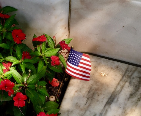
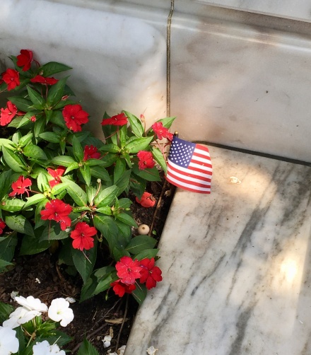
*All photographs are obviously mine. The photograph of the small American flag was near the Tomb of the Unknown Soldier, I wondered if perhaps a young child had placed it there…
*Forgive me for not crediting sources…many are from tour guides and multiple resources from which notes were taken but no one source to provide a consistent resource.
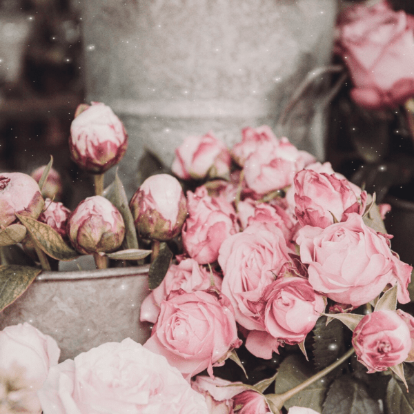
 There may be nothing quite like roses and soft autumn leaves that brings forth sweet nostalgia for me… Roses past their prime or pink tinged rosebuds that are still full of promise. And I tend to prefer the softer side of Fall with the pink and red leaves. A basket full of roses cut from my own, set by our picket fence are precious to me because I know they’ll soon be gone. Then as they wilt and dry, the soft scent is a reminder of a good season of blooms.
 Old roses tend to be destined to be pressed or dried- held within the pages of a well loved book. I found an image of beautiful autumn leaves….there may be no more nostalgic image you could offer than a carpet of fallen leaves. Still. A wedding bouquet and the memories of a romantic getaway. We want to keep them all gathered in our imagination.
 Good marketing sets aside the ‘overwhelm’- the tyranny of urgent demands on our time. Take your readers, your customers on a sentimental journey. Give them kindness, beauty and positive nostalgic mood. They’ll love you for it.
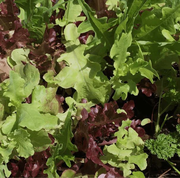
 Greens, the freshness of them, all year round. In spring, I have to admit the tender leaves are such a relief. The first spinach salad with nothing but a simple vinaigrette, perhaps some slivers of onion and lots of bacon are a wonderful treat! We enjoy broccoli all year round yet, I do love it when we’ve grown our own! When grapes are in season, they are plumper and better than the rest of the year- and go with almost anything.
 Collards are a favorite in the Deep South. I took some tender leaves, smeared on a cheddar, blue cheese/ pecan mixture; rolled them up. On a grazing board they were amazing- no cooking required. For the recipe- it’s called
 Then! there’s that Color I love talking about! Color is one of my 9 Principles of Design. Green comes in so many shades and plays well with others…look at how pretty green is with dark burgundy salad leaves! For every color, there’s a corresponding Green that will add a bit of freshness to anything- your Wardrobe, Online shop, your Photography Backgrounds and Backdrops, any of your Designs even your Blog or Social Media feeds!
 As much as I admire simple, curated space – there’s a case to be made for abundance. Let me ask a question first- which organ of the body uses the most energy, the Heart or the Brain? The brain uses a full 20% of the human body’s energy. Sight, sound, scent and taste – these senses originate in the brain, That’s why visual images are so important in design.
 The same brain that loves order also enjoys abundance. Half full or mostly empty are generally unattractive. In any type of brand or campaign for products- balance is key. A product page needs to be simple and curated. A special display benefits from negative space. Your physical store, the cover of a catalog, a travelogue or business blog even newsletter are the perfect places for abundance. And don’t get me started on our homes and gardens.
 Set an abundant bowl of fruit on a simple table and it immediately becomes more attractive. Common food displayed in rustic basket or a bundle of garlic on burlap speaks abundance to the eye. A well stocked store is far more appealing than empty shelves.
 In the landscape, abundance is what we enjoy seeing. An ornate bench is a type of abundance. Used in just the right setting or proportion is beautiful. Generous bouquets are always a welcome sight and tends to warm a simple space up. Green plants generously added to even the most curated space, have a calm, cooling effect in an overly sunny space. Fresh flowers and plants always add to the experience of a home or an event.
 I’m convinced one reason grazing boards are so popular is we like a generous spread and selection of food.
 And isn’t that what we really want? Generosity? Without saying a word- abundance is generous, satisfying and ‘no worries there’s enough to go around’.
 Could we talk about Negative Space? No, no, no- not that negative space of our mental states. Yet, that’s the point too- when we entered this time of lockdown and uncertainty- our minds were affected and overwhelmed. Still, I wondered – what will I do with this time to help others? Those who are pursuing creative endeavors- product based or service based, yes even writing a blog. So, in an effort to put to use some of my experience in creative and conventional marketing. When I gave you


 The point is, your customers or target audience, right now, is also as overwhelmed as you are! Regardless of what you’re selling- cleaning tools to soft leather bags even industrial equipment- the use of Negative Space is your insider tip! Try it, I think you’ll be amazed…

 I was feeling contemplative about the Fourth of July- okay, I was peeling potatoes for the potato salad- a mindless task… that’s when contemplating is easy. We had just gotten back from a last minute trip to Washington D. C., a city that is filled with more profound history and symbolism than perhaps any other in this nation. It’s a white columned marbled and statuesque city- some of the marble was quarried right here in Alabama! Of course I’ve been to DC several times in my long and storied life- yet I always come away with a sense of awe and wonder; always learning something new…or something I knew seems to come alive in my mind. For instance, the expanse of the sky overhead is startling for a major city- there are no skyscrapers- by law. Why?
 Look at the statue that crowns the dome on top of the US Capitol Building. Her name is Freedom.
 When we last visited Washington D.C. renovations were being made to the interior of the dome, now completed, it is once again a masterpiece. I couldn’t help being reminded of one of my favorite Scriptures…


 May I be so bold as to suggest that-between July 4 and July 9 of each year… we make an effort to read the Declaration of Independence?After all, it ultimately became the spectacles through which the US Constitution is interpreted. And in the reading of it, perhaps we will hear the echoes General George Washington’s voice , full of truth and goodness- as he declares Freedom from Tyranny and hear the inspiring words of the majestic document that still inspires generations..
 Remember Freedom? Standing high above our nation’s capitol building? Contemplate Freedom, often. Let nothing overshadow Freedom. Let nothing rise above Freedom.