
One of my favorite quotes is:
‘You have to risk a little crazy in order to escape the gravitational pull of the Ordinary.’ by Tom Samet
I’ve found, to write good Content- you have to risk a little crazy… Visual Images like you see her, start telling the story before you write one word. And, it doesn’t really matter what you do or what your business is- Add a little Crazy… For instance if you’re a Coach who helps with time management- maybe that Frazzled Chick will help you get a smile, and your reader will be drawn in to find out more.

Or maybe you teach yoga or stretching exercises- a crazy Frog will help you tell the reasons you know works! Or part of what you do helps folks relax, an image of a sleeping kitty- yes, they’ll get the concept just from the image!
Do you help folks find their purpose or get direction in their lives? I think I’d read about it, if I saw a charming image of this Big Teddy Bear. It’s wonderful to see a path or a road- though don’t you know, this Bear with a pointing bunny on his shoulder would often get the point across in a whimsical way? 
And, really isn’t that what good Visual Marketing does? It uses whimsy. It uses Visual Imagery to market their products or services. A sketch of a castle or even a Sandcastle you built yourself- gets the point across! I will say this- to Write Better Read
I read a story weeks ago, I kept hearing in my head- something about ‘walking through raindrops’ I couldn’t find the quote so I adjusted it, and it prompted me to write this quote:
I felt like most of life, no matter what was going on, I was Dancing thru Raindrops without getting wet.’
And why did I write it that way? Well, I found this adorable image of a Frog and a lilypad- under it’s own natural umbrella! Don’t forget- it’s serious times we live in, often with serious solutions- Still. If you find a great whimsical image- yours or not- Let the image tell the story before you write a word! Everything doesn’t have to be serious even when the subject is. Add Whimsy… Love y’all, Brenda
Now, I know y’all have heard about my *Free Monthly Planning Guides and May’s Planning Guide is ready and it’s jam packed with fun things to write about!
Thank you to all who have requested it! This month, there’s a *Bonus*- it’s a *Mother’s Day Gift Guide* for product and serviced based businesses- you’ll learn how to price your products, how to really make the Mothers on your customers’ list feel like Queen for a Day! So, if that’s You, all you have to do to get to get the Bonus Gift Guide is- *send me an email at brenda@brenda-wyatt I’d love for you to have it!


 Images that symbolize the Doorway to the Opportunity to present and sell your products or services. Or show someone their Potential. Tell someone what and why you’ve created your art, your online shop, your coaching services.

 I developed 9 Principles of Design that work for me. They all work hard for you, especially with Visual Marketing. My Mimi was a florist and my mother dabbled in art and interior design. With that background and some good training while working in retail, these elements were always present and I hope will serve you well.


 Space is the easiest upgrade- a big clean out makes a room spacious. Adding Negative Space into your displays, your social media grids, your art, writing and more…uplevels all you do!
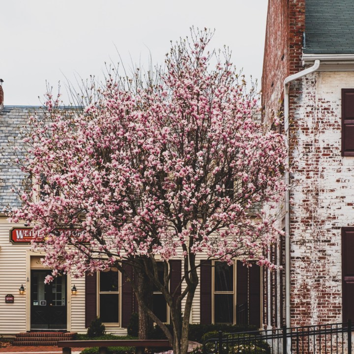 Curb Appeal. Spring seems the perfect time to think about it. Realtors agree that Curb Appeal is the great Attitude Adjuster. 3 Seconds is all it takes to form an opinion or create an impression. It’s interesting that the same 3 Second Rule applies to Social Media, Blogs or Websites. Visual Impressions are everything. Those Pink Blossoms and the Black Door would draw me in. I worked for a beautiful Garden Shop, Most of workdays I was responsible for getting the shop open- with the most important job being- a well swept, clean entrance with a focus on the door. Clean Windows, our most beautiful plants, trimmed and watered and the sign put outside.
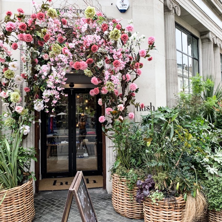 Did you know that a clear Landing Page, like an Open Gate invites visitors to look around your site? There needs to be a balance between the Shelter and Open Spaces. The places where visitors gather and the secure shelter where the living or business is done. A clean welcome entrance, made attractive with green living things adds to the experience whether it’s upscale or an humble place.
 I’m not looking for perfect, just extra good.. Give me one fabulous, well maintained feature, like that Window Box. Give me a measure of simplicity. Even if the site has more formal structures- well kept, clean swept means even more.