 Growth. Everyone wants it, mentally, in knowledge, spiritually, financially, growing a garden and also in personal growth. Yes, growth is greatly desired though to get real growth- you must have a basic curiosity about life and what others are doing to achieve these wonderful things. In terms of business growth, especially now that business demands a virtual presence. So, whether it’s growing a blog or social media accounts, you must understand this:. Real growth isn’t all about your site. It’s about building a community. Finding out what folks need, where they’re willing to spend their time or money- that definitely means knowing what you are able to offer others. So! What I see is lots of folks trying almost desperately to build an email list, growing social media accounts to massive numbers- so that they can be considered ‘influencers’. Still. You must know this- Growing just for the sake of numbers should never be the main goal.
On the other hand, just putting your beautiful writing, recipes, advice, gardening tips or photography out there and expecting folks to find you is as unrealistic as opening up a shop on the far side of nowhere and expecting the crowds to just walk in! It’s unrealistic. You must grow..
 Last year, using the same principles I’ve used to grow this blog, I tried using them on other forms of social media and the effort produced an increase of almost 1000 followers on just one platform. Before I began, I sat down and made a list of how much time and how much I was willing to do on a regular basis. Not only did I see growth, I found some amazing folks in the process. So, here’s what I try to do, I call this my Rule of Four for Growth:
- Leave a ‘like’ and comment on at least 4 accounts I already follow. I no longer think that just leaving a ‘like’ is quite enough to qualify as ‘engagement’ which is what social media platforms keep data on, and it must be said- those platforms ‘like’ engagement!
- Follow no more than 4 hashtags at a time. (Change these up every few months) Hashtags are wonderful places to find folks with common interests or even those who may need your services. I try to leave comments on ‘recent’ posts in the hashtags- not the Top Posts because those are generally very large accounts who probably won’t engage with you or follow you back. And.. I tell the folks I comment on their posts which hashtag I found them on- because we all want to know if the hashtag is working, right?
- On Instagram there is a place for Stories- these are a fascinating look into the accounts I already follow. This is a chance to engage by direct message- much like on the ‘comment section’ on a blog post. I leave an emoji or a comment in 4 Stories. *If someone messages you – for heaven’s sake! Respond in kind! This is true engagement, again- that’s what social media platforms like!
- Find 4 small accounts you like and aren’t currently following- hashtags are a great place for this! And remember everyone starts somewhere . Like and leave a nice comment- gently introduce yourself and let them know where you found them. *Please don’t confine yourself to one age, type or category.

Diversity is far more fun- you will learn about other cultures, other possibilities and believe me it’s fun to get messages from around your country or around the world. I personally think that a problem with social media is that we spend too much time in our ‘tribe’ and not enough time having curiosity about other folks- and I mean that in the nicest way possible! I’ve learned about seafood on Vancouver Island, skincare from Singapore, fashion design in Australia and aren’t those British gardeners amazing? Yes..
Do the first 3 daily – more than if you have time. Do all 4 if time permits- after I post I try to spend about 15 minutes doing my Four Rules for Growth. Go ahead and make yourself sociable- and watch your account grow! And if you’re concerned… here’s my safety rule- Set controls- you know who the kooks are- my settings are on PG only.
Now, I have a little announcement to make- I currently am accepting a few folks for my new Mentoring Program! The first ‘Let’s See if We’re a Good Fit’ session is Free! More details to follow- we’re excited that even though our launch date was March 1, we already have all the slots full this week. So, if you’re interested- leave me a message and I’ll tell you how it works. In the meantime…
Love y’all, Brenda
And a big PS- The March Planning Guide for retail or content posts is ready and it’s Free again this month. Send an email to: brenda@camelliascottage.com We’ll be happy to send it to you!

 Unusual, that’s what snow is in my part of the world. Tornadoes aren’t. We take pictures of the aftermath of tornadoes, we take pictures of snow when we get it. Most of the ones I have were from 2017. And, I’ll admit- I just love to look at images of snow. Why? Because snow is unusual.
 Unusual is something I was called as a child. I had a great aunt who would exclaim to my mother, ‘Isn’t she unusual?’ Referring to me. Every. Single. Time. She saw me. I didn’t like it then.
 The range of colors is astounding this season- from a Gray which is reliable, stable and reassuring to Browns as earthy as garden soil or golden sands, a veritable rainbow of vibrant, fragrant and fresh as a palette of hollyhocks, zinnias or marigolds. There’s an astonishing array of Pinks, glamorous and soft, vibrantly alive. A range of Greens which are happy, responsible yet fresh. The Blues are still around, yet project optimism- they blend over into Aqua and Turquoise sea tones. There’s a mix of Pastels as playful as flower sprigged dresses, lavender fields, violets or birthday cakes.


 Pull up a Chair. Set the scene. Tell me a story without saying a word. I want Time. Timeless. Give me Timelessness anyway you can.

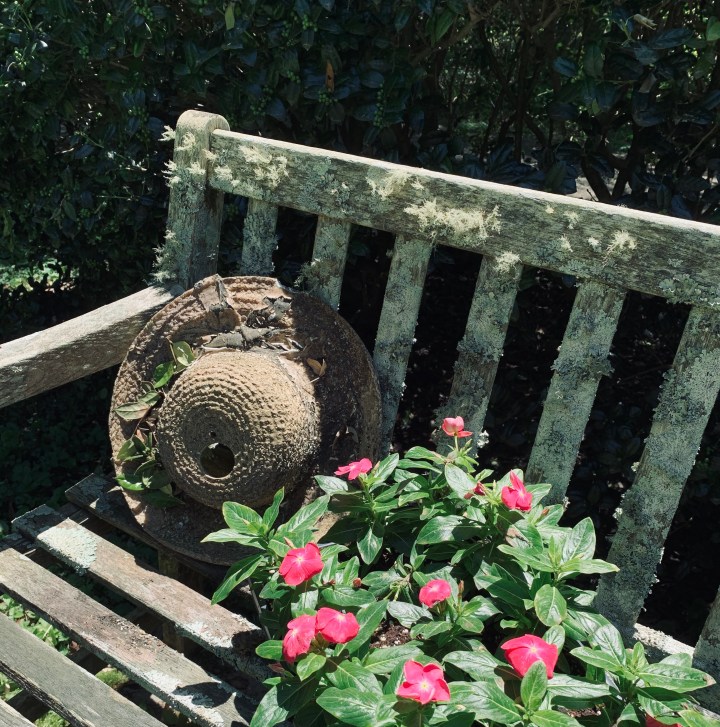

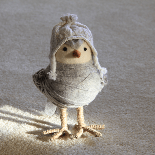
 A little bird stopped by and chirped- ‘What now? What now?’ I knew he wanted me to answer the question- because that’s what a lot of business folks have been asking now that the holidays are over. I whispered to him a few things that could help you with your year end and new year businesses. New Year’s brings so many thoughts, plans, resolutions and concerns. There’s no time like Now- to coach folks through- whether it’s lifestyle changes, journal prompts, even dreams of adding on a service or two. Help your audience see that Time is their friend in this unique season. Here a few tips and at the end of this post, be sure and see my gift to you!